
Data interpretation
Data Interpretation or DI refers to the implementation of procedures through which data is reviewed for the purpose of arriving at an inference. Data can be obtained from multiple sources e.g. data from running of industries, census population data etc. Interpreting data requires analyzing data to infer information from it in order to answer questions. Data can be provided in a number of formats viz: Bars, tables, line graphs, pie graphs.
Bar Graphs
A bar graph or bar chart represents explicit data with rectangular bars. The heights and lengths of these bar graphs are proportional to the values of data they represent. There are two types of bar graph, one is called horizontal bar graph and other is called vertical bar graph. The important thing to remember is that the longer the bar, the greater its value. Bar graphs made up of two axis, one is called x- axis and other is called y- axis. In a horizontal bar graph, y-axis shows the data categories and x- axis shows the scale. In vertical bar graph, x-axis shows the data categories and y-axis shows the scale. In a nutshell, we can compare easily different sets of data between different groups with the help of bar graph.
Tables
In tables, data is described in the form of rows and columns. In DI table’s questions, we are required to read data from table/tables analyze the data and answer the questions asked on the basis of the given data.
DI Questions based on Tables are very common in competitive exams. Rows and Columns of tables consist of various types of data like income of company, expenditure on various items, and marks of Applicants and so on. First column and row of tables represent the titles. Level of Questions in Tables may be lower or higher in comparison of other graphs form, depending on given data in the table and the way,questions are framed.
Line Graphs
A line graph basically is used to visualize values over a certain time period. It is basically used to change over time as various points of data connected by straight line on two axes. It helps to determine the relationship between two sets of values; and also one data set is always dependent on the other set. In many competitive exams, you will see various questions based on line chart problems, in which you are supposed to analyze the data and then answer them.
Pie Charts
Pie charts are circular shaped graphs which are divided into sectors to represent numerical proportions. In a pie chart, the central angle of a particular sector is proportional to the quantity it represents. In other words, we can say a Pie Chart resembles a Pie in which a circle is cut in various sized sectors from center to the boundary. In simple words, the bigger the sector, the higher the proportion.
Bar graphs
A Bar Graph (also called Bar Chart) is a graphical display of data using bars of different heights.
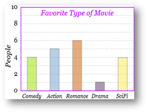
Imagine you just did a survey of your friends to find which kind of movie they liked best:
Table:  Favourite Type of Movie Favourite Type of Movie | ||||
| Comedy | Action | Romance | Drama | SciFi |
| 4 | 5 | 6 | 1 | 4 |
We can show that on a bar graph like this:
Pie charts
The formula to determine the angle of a sector in a circle graph is:
Angle of sector = Frequency of data / Total frequency × 360°
Example:
Imagine you survey your friends to find the kind of movie they like best:
| Table: Favourite Type of Movie | ||||
| Comedy | Action | Romance | Drama | SciFi |
| 4 | 5 | 6 | 1 | 4 |
You can show the data by this Pie Chart:
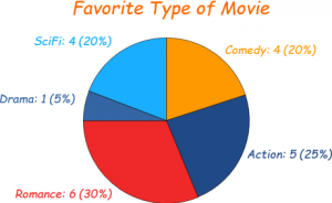
It is a really good way to show relative sizes: it is easy to see which movie types are most liked, and which are least liked, at a glance.
Next, divide each value by the total and multiply by 100 to get a percent:
| Comedy | Action | Romance | Drama | SciFi | TOTAL |
| 4 | 5 | 6 | 1 | 4 | 20 |
| 4/20 = 20% | 5/20 = 25% | 6/20 = 30% | 1/20 = 5% | 4/20 = 20% | 100% |
Now to figure out how many degrees for each “pie slice” (correctly called a sector). A Full Circle has 360 degrees, so we do this calculation:
| Comedy | Action | Romance | Drama | SciFi | TOTAL |
| 4 | 5 | 6 | 1 | 4 | 20 |
| 20% | 25% | 30% | 5% | 20% | 100% |
| 4/20 × 360° = 72° | 5/20 × 360° = 90° | 6/20 × 360° = 108° | 1/20 × 360° = 18° | 4/20 × 360° = 72° | 360° |
KPSC Notes brings Prelims and Mains programs for KPSC Prelims and KPSC Mains Exam preparation. Various Programs initiated by KPSC Notes are as follows:-
- KPSC Mains Tests and Notes Program
- KPSC Prelims Exam 2024- Test Series and Notes Program
- KPSC Prelims and Mains Tests Series and Notes Program
- KPSC Detailed Complete Prelims Notes